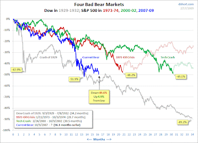
The gray line is the crash of 1929, green the tech crash, red the oil crisis, and blue the current bear market (all but the 1929 data are S&P 500 data; the 1929 is based on the DOW). Note that we are percentage decreases in the market consistent with the tech and oil crashes, but in much shorter time frames. Interestingly, the oil crisis was a "classic V" with a final dip to a bottom and then a recovery. The tech crash has a "double V" pattern with a test of the 50% level twice before recovery. This does not mean much except that we have tested the 50% decline once and are close to that level again. What happens next is anyone's guess...but let's hope it is not cliff diving.


