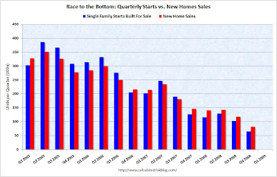
The red bars show quarterly new home sales and the blue bars is quarterly housing starts. Note that 2006-most of 2007, starts exceeded purchases, which implies growing inventories. But, during 2008, purchases exceeded starts, which signals a draw down in inventories. This is relative, of course, because both are racing to the bottom right now...but, maybe we will bleed off inventories enough to start to stabilize price.


